In case you thought that Google’s austere home page design was sacrosanct, think again.
In an effort to win over the locals in Korea, Google has just launched a new design that not only features twice as much text, but also features animation:
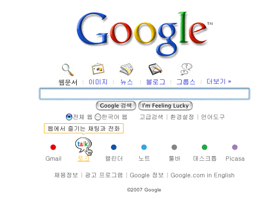
Try it out yourself.
According to Search Engine Land, “The new, animated Google Korea home page is intended to help Google better compete in the country where it seeks to gain market share. ‘It was important where our classic minimalism wasn’t working that we adapt,’ Marissa Mayer, Vice President, Search Products & User Experience at Google, told Danny Sullivan in a briefing earlier today.”
Google isn’t alone in this regard. I often hear from global Webmasters and marketing execs in global companies based in the US and Europe who often do battle with their Web designers and managers in Asia who insist on using lots of Flash-generated animation and dense amounts of text. But what may seem busy and downright silly to a Westerner is anything but to consumers in many parts of Asia.
Does that mean that Western companies have to give up their Web designs when localizing for Korea? Well, they certainly need to be flexible. I recommend a global design template in which the “global” elements take up very little real estate. This will allow for plenty of local customization.
Google Korea is a case study to watch closely. Even with its animated home page, the design is still spare when compared to the likes of Naver and Empas.
Comments are closed.