I’m always amazed when I come across global gateways that I find complicated in my native language.
Like Delta Airline‘s global gateway.
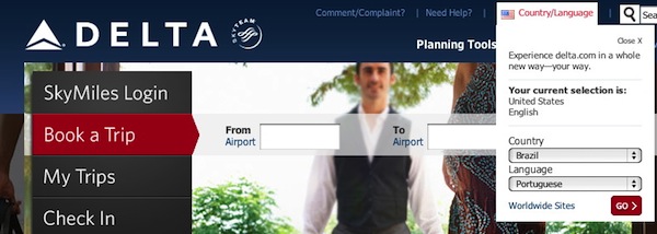
What you see here is not one but two pull-down menus. First you select your country, then language. And don’t you dare try to touch that language menu because it doesn’t work until you select a country.

I’m serious.
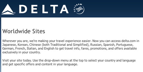
And what about that “Worldwide Sites” link below the menus? Don’t you dare click that link because you’ll end up on a page that basically says this:

Translation: You shouldn’t have clicked the Worldwide Sites link; Now go back and start over.
I’m not making this up. I have no idea why there is a Worldwide Sites link.
I’m not trying to pick on only Delta here. For some reason, a number of airline web sites are suddenly in love with these two-part pull-down menus. I wrote about this earlier.
For more of my rants on global gateways, check out The Art of the Global Gateway.
And to see how Delta rated against other airline web sites, check out the Web Globalization Report Card.

The popup box displaying when clicking on Country/Language does not even render under that actual button in Chromium, but actually more at the bottom left. This makes it impossible to even click the country box, as any movement outside the box will cause it to hide again.
If Delta cannot afford to properly test its website accross popular browsers, I doubt that it has even given much thought to it’s language portal.
John,
Whilst I appreciate that the execution on Delta’s site is far from ideal, what’s your specific issue with having two drop downs for country/language? I’m a great fan of having those drop downs – websites which default a locale are a bane for those of us who don’t speak a local language. The way that the Emirates did this (which you referred to positively in your other posting) is fundamentally flawed in my eyes because the alphabetisation is for one language – why would a German look for “Deutschland” under “G”?
Thanks in advance for any clarification!
Graham
Hi Graham,
You raise a great point about the challenges of sorting regarding Emirates. And I’m not saying that Emirates is perfect in this regard. But that’s a subject for a later post perhaps.
That said, a pull-down menu is not an ideal solution when you’re looking at 50+ options. That’s quite a bit of scrolling for folks in, say, Venezuela. And it’s the two pull-down menus that I take issue with — from a managing expectations point of view.
With Emirates, I can discover fairly quickly if my language is supported. With Delta, I have to do a bit of work. Take Greece. I have to first scroll to the country name before I can know whether or not Greek is supported. Emirates also does not support Greek but I don’t have to do any clicking or scrolling to discover this.
Hi John,
Regarding your previous comment: it would be interesting to hear about “interface interaction knowledge”-statistics.
For example, what percentage of internet users know that you can actually press the first letter of a pull-down menu to quickly jump to that position? If such percentage is high, your view on pull down menus is probably going to change, since there is almost no scrolling involved. If any such statistics are available, this might be a great idea for an upcoming post?
Tom
I like John’s idea of simplicity and reducing the amount of education needed to navigate through a site.
It would be interesting to test per region how fast (number of clicks or number of seconds) users gain access to their local page using various options (map image vs. drop-down vs. perhaps a basic text based sitemap). I would be surprised if the quick selection approach by hitting the key of the first letter in a drop-down is as favorable as the Emirates’ approach of the image of a map . I am surprised how many people I know in Europe and the US who still do not use keyboard shortcuts to speed up their workflow. I bet for less mature internet markets, that number is likely to be even lower.