Imitation is the sincerest form of flattery, the saying goes.
So I suppose I should have been flattered when I came across four new posters by the esteemed design firm Pentagram.
Judge for yourself.
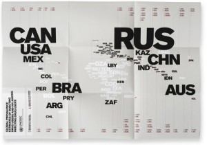
Here’s one of the Pentagram posters:

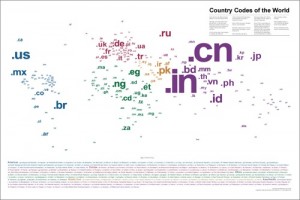
And here’s mine:

It could very well be coincidence that the designers came up with their concept independently. But I can’t help but think perhaps they came across my poster sometime over the past two years, when it’s been featured on such design web sites as Communication Arts and Smashing Magazine.
Though I’ve trademarked the poster, you can’t copyright an idea, just the execution of that idea. This issue is nothing new. The New York Times had an interesting article about it a few years back. Ideas influence ideas, directly, indirectly, or cosmically, and that’s the way the world works.
And it is flattering to see high-profile designers (influenced or not) applying a similar design concept.
What do you think?

Well, great minds clearly think alike!
They do have a slight difference in their concept, though. It looks like they are sizing their letters according to number of square kilometers in the country rather than population of the country.
Yours is much better, John. Better looking and better design. Their “posters are a training tool specifically aimed at the Russian police, whose country has a particularly poor track record in drug treatment. The posters had to be eye-catching, easy to absorb and not reliant on language. The typographic solution built a simple world map from internationally recognised country abbreviation codes (GB, US, RU, etc).” I’m not a Russian cop, but I’d give their version a big “nyet” in terms of accomplishing those objectives.